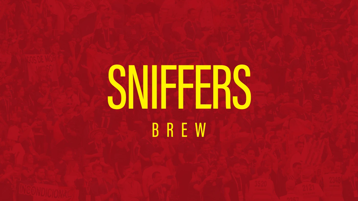
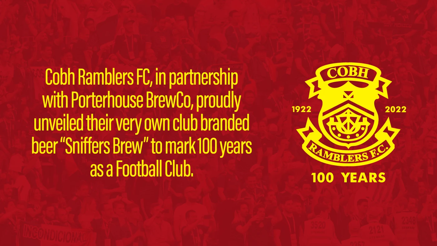
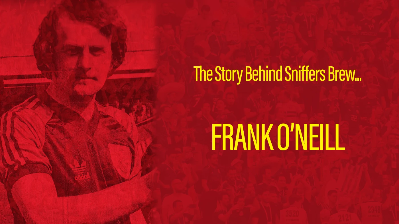
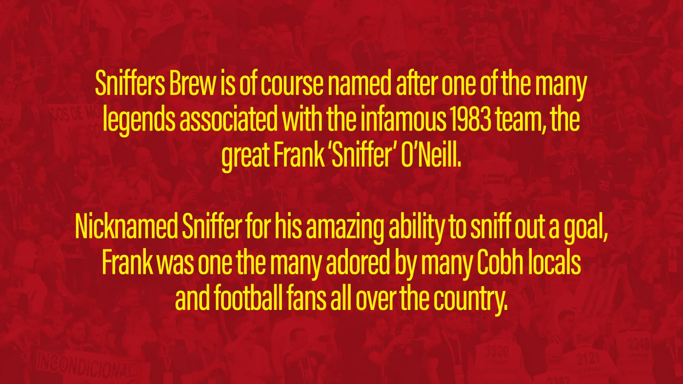
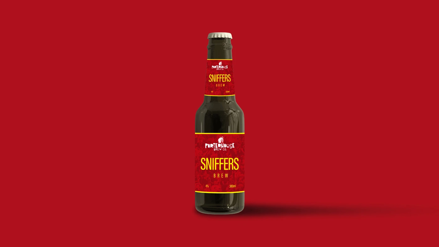
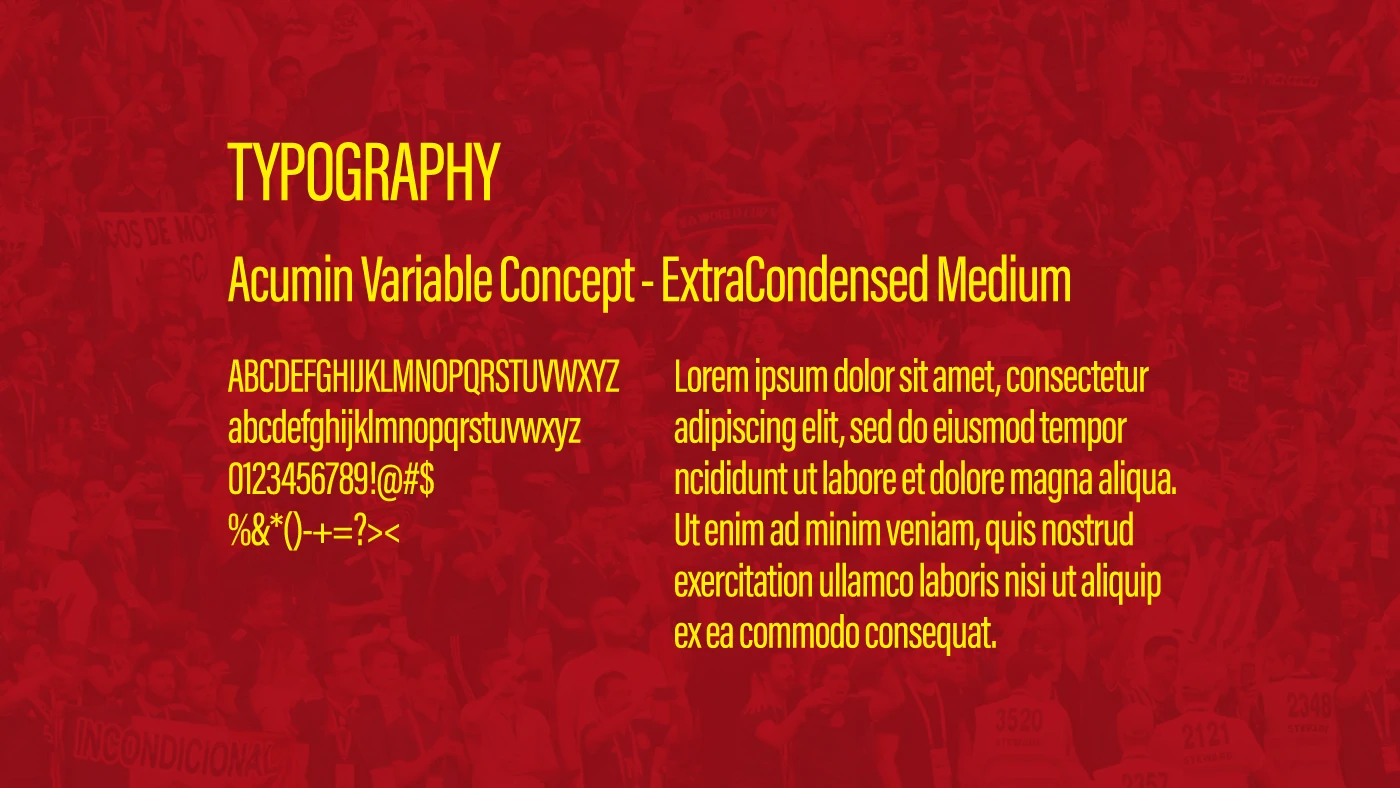
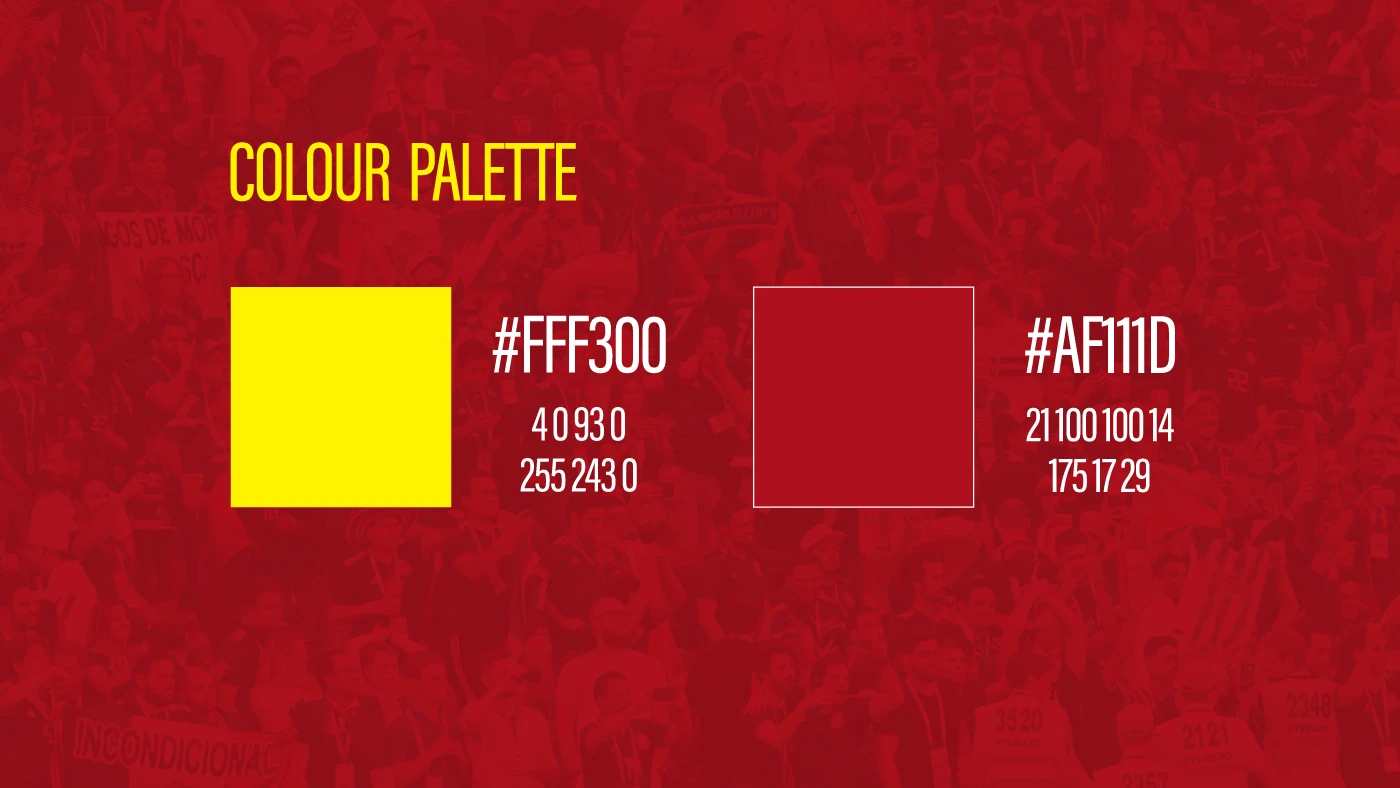
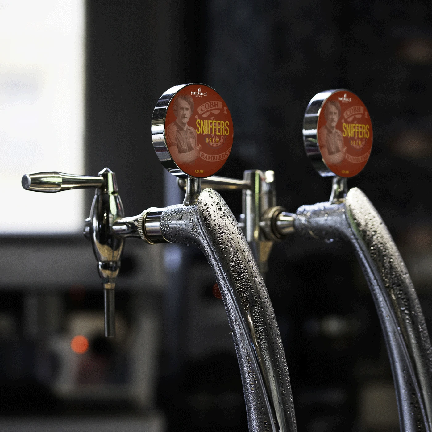

The branding of Sniffers Brew was conceived to pay tribute to the legacy of Cobh Ramblers’ celebrated figure Frank ‘Sniffer’ O’Neill — a design journey rooted in local heritage and spirited identity. From the outset, the creative team embraced the beer’s story: a crisp lager brewed in partnership with Porterhouse BrewCo to mark the club’s centenary year. cobhramblers.ie The logo was developed with bold typography to reflect the confident, energetic character of the “Sniffer” name: strong letterforms that suggest both cheer and stride. The type-choice leans clear and modern, ensuring readability on tap handles, cans and club-memorabilia. In terms of colour palette, the design honours the club’s colours and local roots — likely incorporating deep greens or oranges (inspired by Irish football and island tones) alongside a clean accent of white or metallic to enable crisp contrast and premium feel. Every stage of the process, from naming the brew to selecting the font pairing and finalising the can label, was aimed at blending authenticity (a local football legend) with accessibility (a refreshing lager for fans and visitors). The result is a brew identity that feels part-club, part-celebration, and entirely rooted in community pride.